There have been several changes made to The Cultivated Acre in the last couple of months, both in content and style. Since yours truly is more of a substance over style kind of guy, I'll start with additions to the content of this site (not counting this page, itself a recent addition.)
The HTML and search areas have been beefed up considerably. The HTML page has several new links that should help people to write better pages. (I have also added a page with my own brief history as an HTML author, along with a few thoughts on the design of The Cultivated Acre.) The search page is now not merely a listing of several popular search engines, but a place where one can learn how to use search tools to best advantage. You may also notice a few new links on the television page as well.
I am also pleased to tell you that the travel area of the site now contains both the personal journal of my Alaska trip with my father and an extensive collection of images from the trip. This is something I've hoped to do for some time--I'm glad to have finally completed this. I hope it gives you at least a taste of what Alaska was like.
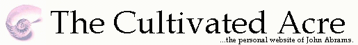
As for style, those of you who have visited the site in the past will notice that the large nautilus image that used to be on top of the page has been made smaller and incorporated into a title banner. This reduces the whitespace up top and gives folks a chance to read a bit more of the material on each page before they have to start scrolling.I've also done some font tweaking. I am now using Book Antiqua as the default font for the text of pages for The Cultivated Acre, with Arial for the bottom quotes and site listings. Since this site is not overly dependent on matters of style, personal alternatives to these choices shouldn't make too much difference in the presentation of these pages.
In addition, I've changed the 'ALT' qualities for the small nautilus buttons on my pages, changing them from a repeat of each listing to an asterisk. That way, folks with non-graphical browsers will see the asterisk in the place of the nautilus button followed by the listing instead of having the listing duplicated. As you can gather from reading the index page and my HTML personal history page, I really do want this site accessible to as many people as possible.
As for future changes and additions, somewhere down the road I might add a few pages about the farm, to give people the chance to see some of our equipment and offer a view of how a farm operates. One obvious problem is that when the greatest activity is going on, in the summer, yours truly has no time to stop and take pictures! Sometime, I might add material to the chess page, with possible topics being a few of my better games, or some personal tips for novices to improve their game, or perhaps something in connection with ChessWeb's first 1000 games. A third possibility is the addition of my images to the Pine Barrens section.
One other content idea that I might try sometime is the concept of a 'missing link.' My idea would be to make a spot somewhere on one of the pages of the site be a hidden (or missing) link to an extra page, either a page of my own creation (probably with an image of a caveman or Neanderthal...or else I could just use 'my' picture!), or an outside page that I think most folks would find fun. But with spring fast approaching, there probably will be no time available to implement any of these possible changes for the next several months.
One other area where this site will require work down the line is in the use of style sheets. Right now, I feel between a rock and a hard place regarding employing them. Some things I read advise to use them now, and abandon the old, deprecated tags. Others advise just the opposite, noting that a lot of browsers don't even recognize style sheets. Since I have to think that the old tags will still be supported, at least in the short term, I am leaving them in place and not using style sheets for now. Perhaps after this year, I may have to re-think that.
I may also try reducing the width of the text area in a future version of The Cultivated Acre. Some style guides I've read have said that it is not ideal to have text covering the entire width of the screen. This too will probably not be something I'll try in the near future.
As always, your comments are appreciated. I hope you will continue to follow the progress of The Cultivated Acre as it grows and evolves.
--John Abrams, March 3, 1999
[Agriculture]
[Chess]
[HTML]
[Main]
[Nautilus]
[Pine Barrens]
[Search]
[Site Map]
[Sports]
[Television]
[Travel]
{Attribution page--main}
{What's new}
Copyright © 1998-9 John Abrams.
All rights reserved.
/Heartland/Acres/5076/new.html
Last modified on March 3, 1999